 by Algolia
Styling DocSearch
DocSearch default color scheme comes in a grey theme with blue highlight.
Colorscheme#
This theme works well with most websites, but we encourage you to style it to your own theme. You can achieved it by overriding the CSS classes used by the default theme.
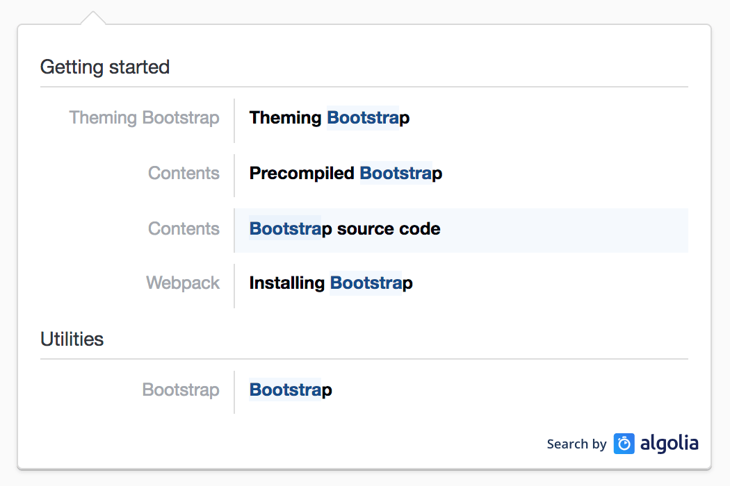
The following annotated example will help you style each part:
Attribution#
We're happy to provide DocSearch free of charge for any documentation website, and you're encouraged to style it to fit your own theming. All we ask is that you keep the "Search by Algolia" logo and link next to your search results.
The logo is automatically added in the dropdown with the default styling. It's our way to let more people know about what we do, and how they could benefit from a fast and relevant search on their website.
If you're using your own paid Algolia account and run the crawler yourself, you don't have to keep the logo.
Debugging#
To inspect the dropdown markup with your browser tools, you should add
debug: true to your docsearch call to prevent it from closing on inspection.
Other considerations#
The dropdown wraps selected suggestions in a .ds-cursor class. This means that
you can use .ds-cursor .algolia-docsearch-suggestion--content to style the
selected suggestion for example.
On small screens, DocSearch reverts to a single column layout, while is uses the
two-column layout shown in the screenshot on larger screens. You can add media
queries (for example @media (min-width: 768px) {}) to target different
displays.
Advanced styling#
Whether you would like to do more heavy styling, feel free to have a look at the
SCSS source code. _variables.scss contains all the default theming,
sizing and breakpoints.
You can generate your own CSS file by cloning the repository and running
yarn run build:css. It generates the resulting file in ./dist/cdn, and you
should use them instead of the default one.